Kojo provides trade contractors a way to manage construction materials procurement, tools, and warehouse inventory. Within construction tech, I led design for the fintech offering Kojo AP (accounts payable) which covers the last steps of the procurement process – invoicing and payments. Kojo AP is a suite of features designed for commercial construction accounting teams and streamlines the invoice reconciliation and approvals process.
⭐ Invoice PaymentsHighlighted Work (1 of 2)
Prior to joining the team, the work needed to launch payments was already in progress - an extensive payments roadmap was already defined, MVP designs were already done, and engineering work for the MVP was at the tail end. However, the team was stuck and already 1+ months behind in launching the beta. The MVP included the ability for customers to apply for underwriting approval for payments, adding bank accounts, and paying for invoices via direct debit / ACH.
The payments roadmap was unrealistic and focused on adding a lot of net-new features. It didn't make senses to try and expand the payments offering if we couldn't even provide the basics so I pushed to prioritize work based on the AP user needs and workflows.
Documenting the customer journey and money movement
Each part of the experience was worked on separately with no documentation so no one had a clear picture of how everything actually worked. I QA’d the MVP implementation and mapped out the customer journey to understand how a customer onboards for payments, what happens when a payment is initiated, and how vendors receive the payment. There were A LOT of gaps and so I created tickets and necessary designs to add improvements to the MVP and roadmap. There were A LOT of bugs so I logged tickets to get these issues fixed prior to launch.
Note: Image blurred to keep flow of funds private.

Enhancing the beta experience
An MVP experience will be limited but shouldn't compromise the experience, especially when it involves the movement of money. I made some improvements before the beta launch to provide a more polished experience because the first impression always matters!
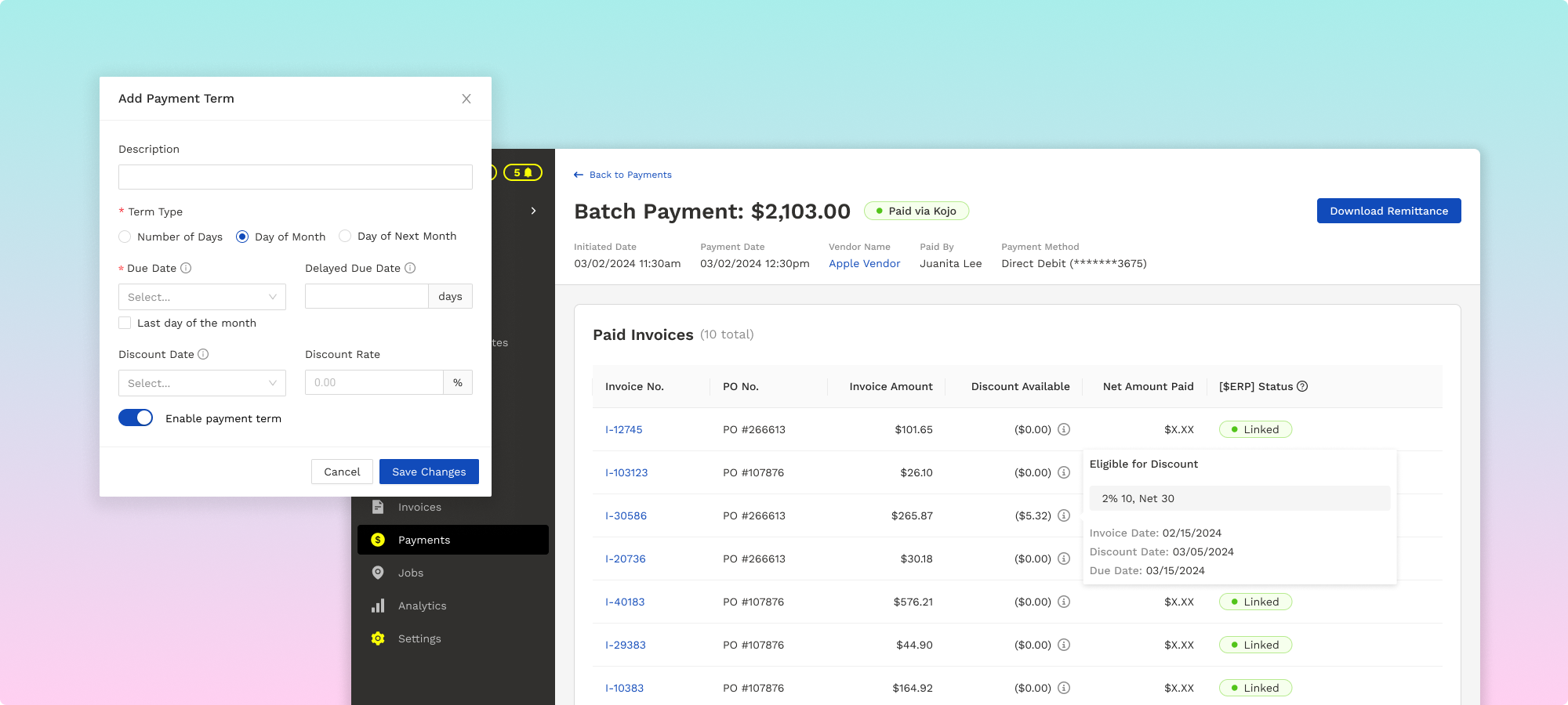
Before: No ability to enter discounts, required manual input of bank account info to confirm payment, crammed information for batch payment (multi-vendor and multi-invoice payments) into small modal.
After: Added discounts, improved structure of information, moved crammed content of batch payment to in-page experience and made it easier to review info.

Vendor experience
Once a customer initiates a payment and the funds are successfully secured, a payout is then sent to the vendor as a separate transaction. Vendors may not be the main users, but they shouldn't be neglected and should still have visibility into payments received via Kojo.
Before:Poor vendor experience for beta launch, status was confusing since it only reflected when customer funds are secured, remittances were not generated at all, payments table was cluttered with unnecessary data.
After:Updated payments table to provide more visibility into individual payments, flagged and prioritized remittance bug fixe, added email notification for vendors who didn't want to log in. Added virtual card capabilities post-beta.
Improving the current payments offering
Additions:
- Ability to view payment data (previously not available).
- Ability for payment terms to calculate due date and discounts (previously manual).
- Ability for customer to invite vendors to onboard for payments (previously manual).
Wins:
- Business: new revenue stream added.
- Customers: ability to pay digitally to eliminate the risks of using checks
- AP Product: a complete end-to-end procurement workflow is now available on a single platform.
While there were still plenty of opportunities to continue improving the payments offering, there wasn't a demand yet from customers. Construction is an industry that hasn’t seen much tech innovation so the legacy ways of paying by check or existing ways of paying through a vendor portal are hard to change. A bigger issue I noticed and flagged was the low adoption rate for invoicing. I strongly believed having a solid invoicing product was a prerequisite to payments adoption. Thankfully, I was able to make a case and get buy-in to prioritize redesigning the invoicing experience (see below).
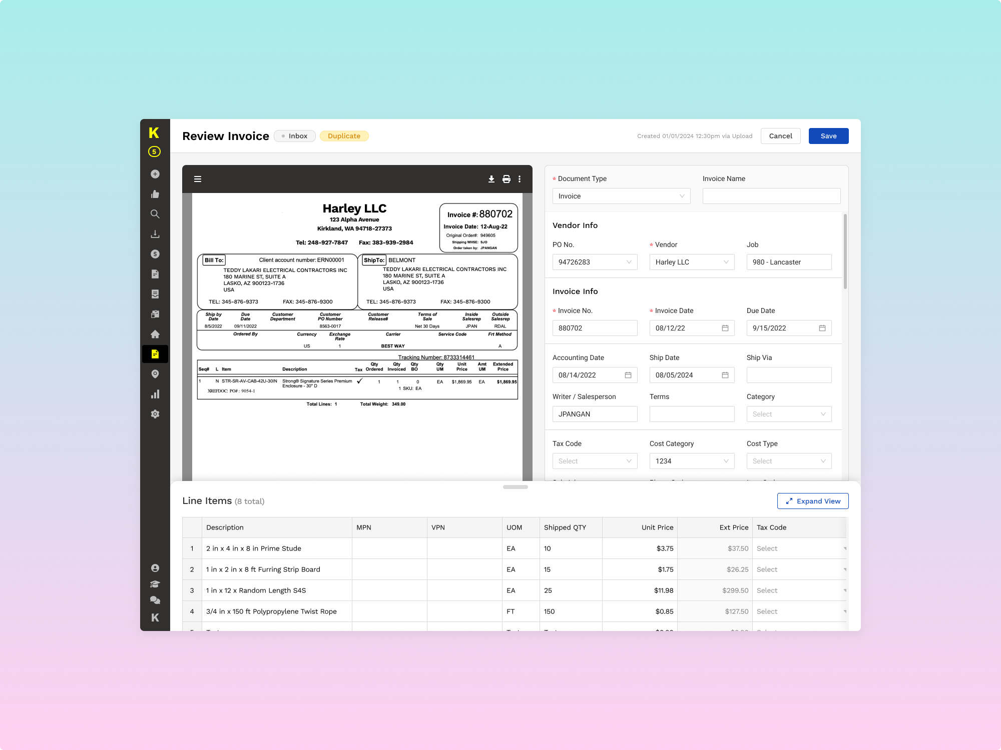
⭐ Invoice Detail Page RedesignHighlighted Work (2 of 2)
Invoicing is the second to the last step of the procurement process where customers receive vendor invoices for the materials procured and ordered via purchase orders. This step is where AP users reconcile and approve invoices for payment. If there is no strong invoicing adoption, there will be no path to payments adoption.
I led the end-to-end product development process for the redesign (research, design, product, eng prioritization, QA), strategized a rollout plan and successfully executed against it, worked with cross-functional partners to ensure they were trained and up-to-date, and followed up with customers to get initial feedback.
Qualitative and Quantitative Research
- Used Fullstory (behavioral data platform) to analyze user behavior based on actions and funnels, and watch session replays to understand actual usage.
- Chatted with and sifted through feedback recorded by Product, Sales, Customer Success, and Support.
- Met with customers of different sizes to understand their workflows, pain points, and experience with the invoicing product.
- Completed market research and competitive analysis to understand AP better

Invoicing Product Overview
Usage & Adoption
- 1+ year old product that is only available as upsell (Kojo AP)
- Captures small percentage of the total purchase order volume
- Not all customers pay for AP (over 50% though)
- Of the customers that do have AP: [1] a small percentage doesn't know they have it so they don't use it, [2] some have used it but abandoned it for various reasons, and [3] some actively use it (either for all vendors or only some).
UX Issues:
- Confusing, intimidating, and unintuitive experience
- No clear invoice status and/or progress
- Overloaded with content that isn't filtered to be relevant to invoice
- Unorganized data that is hard to navigate
- Unclear why certain information is highlighted - creates distractions
- Conflicting and differing design patterns/components

Initial Impact
Highlights:
- User Experience: User Experience: streamlined workflow and simplified the experience to make it more organized and intuitive, experience driven by user/internal feedback
- Invoicing Product: better foundation to build on top of, new features were added seamlessly
- Customers: experienced quicker processing times for invoices, users felt confident in onboarding more colleagues onto the invoicing product, able to find things in the new experience because it was intuitive, excited to see new product changes that will solve other issues
- Engineering: easier to diagnose issues and add new features, backlog of bugs were mostly eliminated due to updates
- Customer Journey: easier for Sales to demo and prospects were impressed with experience, Support logged less bugs, easier for CS to onboard customers
- Design: established the initial foundation for a design system, standardized patterns and components
While redesigns will never please everyone, the overall initial reception was pretty positive from both internal users and customers. It took the invoicing product from a buggy MVP experience to a polished and intuitive experience. Under the hood, the legacy code was eliminated and made it easier to manage and add new features. Overall, there is now a better foundation to build a scalable product and design better experiences without constraints.